
DurationPicker
Functions summary
Unit |
@RequiresApi(value = 26)A full screen DurationPicker that allows users to select a duration. |
Functions
DurationPicker
@RequiresApi(value = 26)
@Composable
fun DurationPicker(
    initialDuration: Duration,
    onDurationPicked: (Duration) -> Unit,
    modifier: Modifier = Modifier,
    minValidDuration: Duration? = null,
    maxValidDuration: Duration? = null,
    durationPickerType: DurationPickerType = DurationPickerDefaults.type,
    initialSelection: DurationPickerSelection = DurationPickerDefaults.initialSelection(durationPickerType),
    colors: DurationPickerColors = DurationPickerDefaults.colors()
): Unit
A full screen DurationPicker that allows users to select a duration.
DurationPicker allows the caller to provide the initial duration, the columns presented (such as hours/minutes or minutes/seconds) and validation of minimum/maximum durations.
This component is designed to take most/all of the screen and utilizes large fonts.
minValidDuration is rounded up and maxValidDuration is rounded down to the smallest visible unit for the given durationPickerType (whole minutes for DurationPickerType.HoursMinutes, and whole seconds for all other types), so every value the user can pick is between minValidDuration and maxValidDuration. initialDuration is rounded down to the smallest visible unit.
Individual column options outside [minValidDuration, maxValidDuration] are displayed using DurationPickerColors.invalidPickerContentColor.
If initialDuration (for example, Duration.ZERO) is less than minValidDuration or greater than maxValidDuration after rounding, the picker opens at initialDuration with the confirm button disabled. Auto-scrolling is enabled after the first scroll: whenever scrolling settles on an out-of-range duration, each invalid column automatically animates to its nearest valid option.
Example of a DurationPicker with hours, minutes, and seconds:
import androidx.compose.foundation.layout.Box
import androidx.compose.foundation.layout.fillMaxSize
import androidx.compose.material.icons.Icons
import androidx.compose.material.icons.filled.Edit
import androidx.compose.runtime.mutableStateOf
import androidx.compose.runtime.remember
import androidx.compose.ui.Alignment
import androidx.compose.ui.Modifier
import androidx.compose.ui.platform.LocalLocale
import androidx.wear.compose.material3.Button
import androidx.wear.compose.material3.DurationPicker
import androidx.wear.compose.material3.DurationPickerType
import androidx.wear.compose.material3.Icon
import androidx.wear.compose.material3.Text

var showDurationPicker by remember { mutableStateOf(true) }
var duration by remember { mutableStateOf(Duration.ofHours(1).plusMinutes(30)) }

if (showDurationPicker) {
    DurationPicker(
        initialDuration = duration,
        onDurationPicked = {
            duration = it
            showDurationPicker = false
        },
        durationPickerType = DurationPickerType.HoursMinutesSeconds,
    )
} else {
    Box(modifier = Modifier.fillMaxSize(), contentAlignment = Alignment.Center) {
        val hours = duration.toHours()
        val minutes = duration.toMinutes() % 60
        val seconds = duration.seconds % 60
        val labelText =
            "%02d:%02d:%02d".format(LocalLocale.current.platformLocale, hours, minutes, seconds)

        Button(
            onClick = { showDurationPicker = true },
            label = { Text("Selected Duration") },
            secondaryLabel = { Text(labelText) },
            icon = { Icon(imageVector = Icons.Filled.Edit, contentDescription = "Edit") },
        )
    }
}

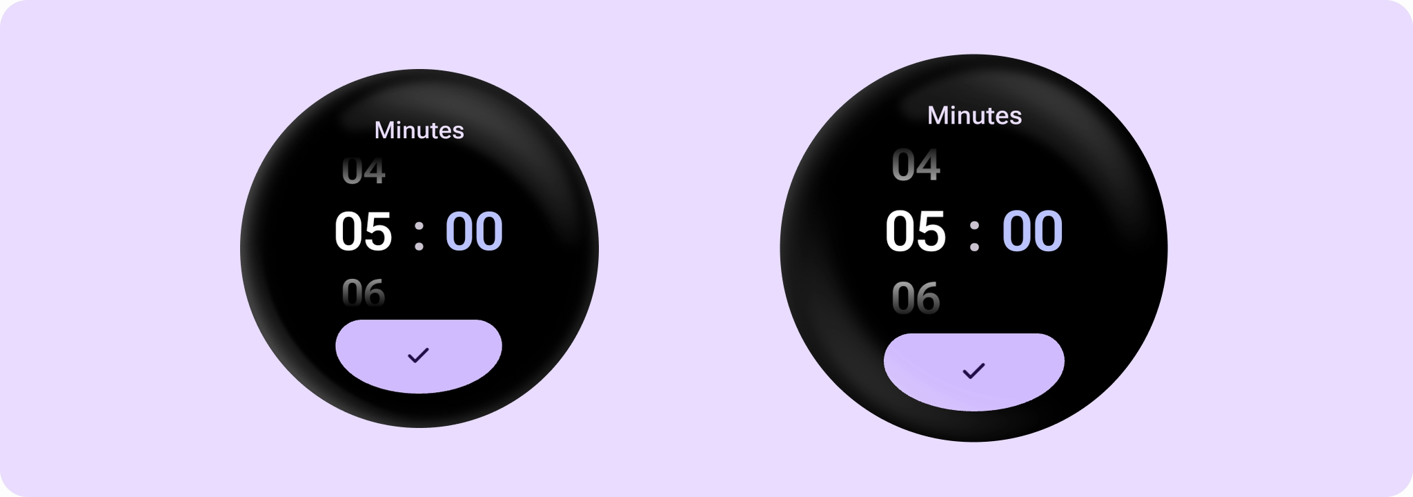
Example of a DurationPicker with minutes and seconds:
import androidx.compose.foundation.layout.Box
import androidx.compose.foundation.layout.fillMaxSize
import androidx.compose.material.icons.Icons
import androidx.compose.material.icons.filled.Edit
import androidx.compose.runtime.mutableStateOf
import androidx.compose.runtime.remember
import androidx.compose.ui.Alignment
import androidx.compose.ui.Modifier
import androidx.compose.ui.platform.LocalLocale
import androidx.wear.compose.material3.Button
import androidx.wear.compose.material3.DurationPicker
import androidx.wear.compose.material3.DurationPickerType
import androidx.wear.compose.material3.Icon
import androidx.wear.compose.material3.Text

var showDurationPicker by remember { mutableStateOf(true) }
var duration by remember { mutableStateOf(Duration.ofMinutes(5)) }

if (showDurationPicker) {
    DurationPicker(
        initialDuration = duration,
        onDurationPicked = {
            duration = it
            showDurationPicker = false
        },
        durationPickerType = DurationPickerType.MinutesSeconds,
    )
} else {
    Box(modifier = Modifier.fillMaxSize(), contentAlignment = Alignment.Center) {
        val minutes = duration.toMinutes()
        val seconds = duration.seconds % 60
        val labelText = "%02d:%02d".format(LocalLocale.current.platformLocale, minutes, seconds)

        Button(
            onClick = { showDurationPicker = true },
            label = { Text("Selected Duration") },
            secondaryLabel = { Text(labelText) },
            icon = { Icon(imageVector = Icons.Filled.Edit, contentDescription = "Edit") },
        )
    }
}
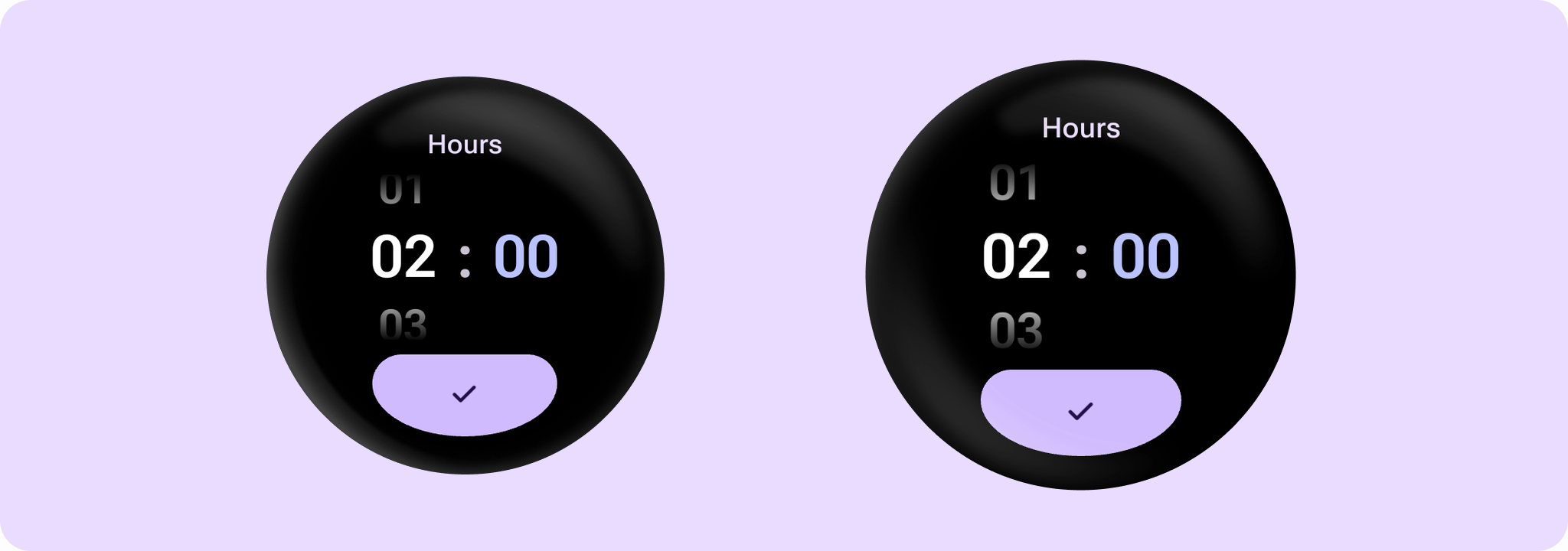
Example of a DurationPicker with hours and minutes:
import androidx.compose.foundation.layout.Box
import androidx.compose.foundation.layout.fillMaxSize
import androidx.compose.material.icons.Icons
import androidx.compose.material.icons.filled.Edit
import androidx.compose.runtime.mutableStateOf
import androidx.compose.runtime.remember
import androidx.compose.ui.Alignment
import androidx.compose.ui.Modifier
import androidx.compose.ui.platform.LocalLocale
import androidx.wear.compose.material3.Button
import androidx.wear.compose.material3.DurationPicker
import androidx.wear.compose.material3.DurationPickerType
import androidx.wear.compose.material3.Icon
import androidx.wear.compose.material3.Text

var showDurationPicker by remember { mutableStateOf(true) }
var duration by remember { mutableStateOf(Duration.ofHours(2)) }

if (showDurationPicker) {
    DurationPicker(
        initialDuration = duration,
        onDurationPicked = {
            duration = it
            showDurationPicker = false
        },
        durationPickerType = DurationPickerType.HoursMinutes,
    )
} else {
    Box(modifier = Modifier.fillMaxSize(), contentAlignment = Alignment.Center) {
        val hours = duration.toHours()
        val minutes = duration.toMinutes() % 60
        val labelText = "%02d:%02d".format(LocalLocale.current.platformLocale, hours, minutes)

        Button(
            onClick = { showDurationPicker = true },
            label = { Text("Selected Duration") },
            secondaryLabel = { Text(labelText) },
            icon = { Icon(imageVector = Icons.Filled.Edit, contentDescription = "Edit") },
        )
    }
}
Example of a DurationPicker with a maximum duration exceeding 24 hours:
import androidx.compose.foundation.layout.Box
import androidx.compose.foundation.layout.fillMaxSize
import androidx.compose.material.icons.Icons
import androidx.compose.material.icons.filled.Edit
import androidx.compose.runtime.mutableStateOf
import androidx.compose.runtime.remember
import androidx.compose.ui.Alignment
import androidx.compose.ui.Modifier
import androidx.compose.ui.platform.LocalLocale
import androidx.wear.compose.material3.Button
import androidx.wear.compose.material3.DurationPicker
import androidx.wear.compose.material3.DurationPickerType
import androidx.wear.compose.material3.Icon
import androidx.wear.compose.material3.Text

var showDurationPicker by remember { mutableStateOf(true) }
var duration by remember { mutableStateOf(Duration.ofHours(36).plusMinutes(45)) }

if (showDurationPicker) {
    DurationPicker(
        initialDuration = duration,
        onDurationPicked = {
            duration = it
            showDurationPicker = false
        },
        maxValidDuration = Duration.ofHours(45).plusMinutes(30),
        durationPickerType = DurationPickerType.HoursMinutes,
    )
} else {
    Box(modifier = Modifier.fillMaxSize(), contentAlignment = Alignment.Center) {
        val hours = duration.toHours()
        val minutes = duration.toMinutes() % 60
        val labelText = "%02d:%02d".format(LocalLocale.current.platformLocale, hours, minutes)

        Button(
            onClick = { showDurationPicker = true },
            label = { Text("Selected Duration") },
            secondaryLabel = { Text(labelText) },
            icon = { Icon(imageVector = Icons.Filled.Edit, contentDescription = "Edit") },
        )
    }
}
| Parameters | |
|---|---|
initialDuration: Duration |
The initial duration to be displayed in the DurationPicker. Must be non-negative and not exceed the limit for |
onDurationPicked: (Duration) -> Unit |
The callback that is called when the user confirms the duration selection. It provides the selected duration as |
modifier: Modifier = Modifier |
Modifier to be applied to the |
minValidDuration: Duration? = null |
The minimum valid duration that can be confirmed. Must be non-negative and not exceed |
maxValidDuration: Duration? = null |
The maximum valid duration that can be confirmed. Must be non-negative and not exceed the limit for |
durationPickerType: DurationPickerType = DurationPickerDefaults.type |
The different |
initialSelection: DurationPickerSelection = DurationPickerDefaults.initialSelection(durationPickerType) |
The initial component to be selected. If |
colors: DurationPickerColors = DurationPickerDefaults.colors() |
|