
drawCurvedToEdge
Functions summary
Modifier |
@RequiresApi(value = 33)A |
Functions
Modifier.drawCurvedToEdge
@RequiresApi(value = 33)
fun Modifier.drawCurvedToEdge(
    maxSweepAngle: Float = DrawCurvedToEdgeDefaults.ScrollableContentMaxSweepAngle,
    angularDirection: AngularDirection = AngularDirection.Clockwise,
    anchor: Float = 270.0f,
    anchorType: AnchorType = AnchorType.Center
): Modifier
A Modifier that transforms a component to an arc around the border of its circular, parent container. Useful for circular screens. It works by first drawing outside the bounds of the container, then a shader is applied that calculates and draws the curved content. This only affects the drawing of the content.
This is a performant alternative to androidx.wear.compose.foundation.CurvedLayout. The shader implementation warps everything, whereas CurvedLayout with androidx.wear.compose.foundation.curvedComposable isn't able to do warping (you can only warp curvedText using the warpOffset parameter in androidx.wear.compose.foundation.CurvedTextStyle). Use this for simple curved content (such as a single line of text, icons or a row of small composables) when targeting API 33 and higher.
Note that Wear Material 3 UX guidance recommends that curved content should not exceed the sweep angle DrawCurvedToEdgeDefaults.ScrollableContentMaxSweepAngle on screens with scrollable content such as lists. This limit is enforced by default. For screens without scrollable content, DrawCurvedToEdgeDefaults.StaticContentMaxSweepAngle may be used instead.
If the container is a rectangle, it will be treated as a circle with radius of the height divided by 2.
The content is wrapped along the edge of the container and shrinks the further in from the edge it is drawn: a second line of text is visibly smaller than the first, and tall content tapers towards the center. Do not inset the content with padding or spacers on the center-facing side, that only shrinks it; to draw the arc further from the edge, pad the parent container instead. Apply Modifier.drawCurvedToEdge before any layout modifiers (such as Modifier.padding or Modifier.offset) on the same element. Additionally, any modifiers applied after Modifier.drawCurvedToEdge are warped as part of the curved content itself.
Not recommended for clickable components, as the clickable bounds cannot be modified to match the new morphed shape. Talkback also doesn't highlight the components correctly.
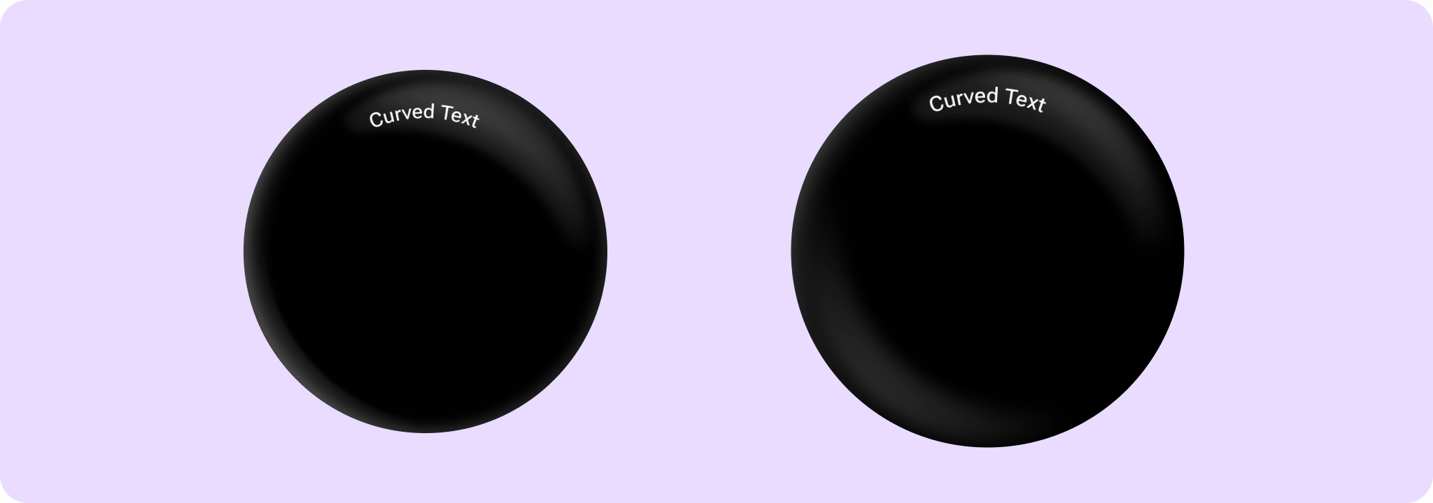
Simple example of applying Modifier.drawCurvedToEdge to text:
import androidx.compose.ui.Modifier
import androidx.wear.compose.material3.Text
import androidx.wear.compose.material3.drawCurvedToEdge

Text("Curved Text", Modifier.drawCurvedToEdge())
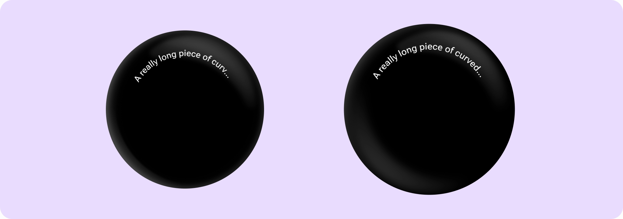
Example of drawing the arc further in from the edge by padding the parent container, with overflow handling for a long piece of text:
import androidx.compose.foundation.layout.Box
import androidx.compose.foundation.layout.fillMaxSize
import androidx.compose.foundation.layout.padding
import androidx.compose.ui.Modifier
import androidx.compose.ui.text.style.TextOverflow
import androidx.compose.ui.unit.dp
import androidx.wear.compose.material3.DrawCurvedToEdgeDefaults
import androidx.wear.compose.material3.Text
import androidx.wear.compose.material3.drawCurvedToEdge

// Pad the parent to draw the arc further in from the edge. Padding the curved content itself
// would only shrink it.
Box(Modifier.fillMaxSize().padding(8.dp)) {
    Text(
        "A really long piece of curved text",
        Modifier.drawCurvedToEdge(DrawCurvedToEdgeDefaults.StaticContentMaxSweepAngle),
        overflow = TextOverflow.Ellipsis,
        maxLines = 1,
    )
}
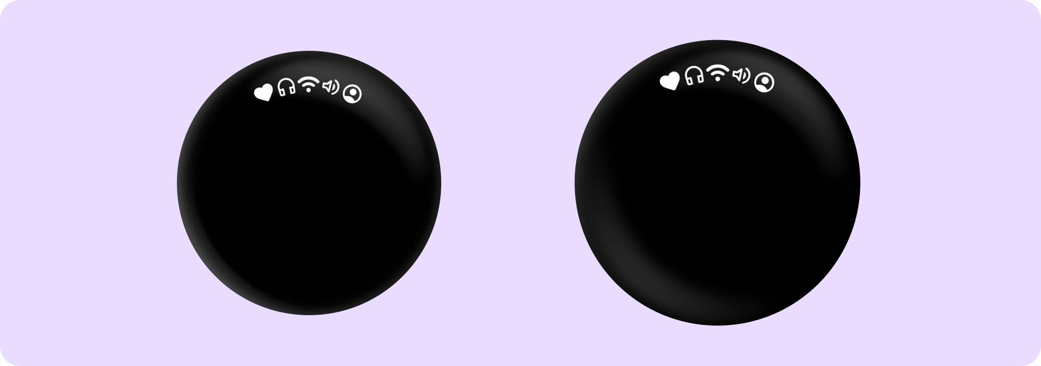
Example of applying Modifier.drawCurvedToEdge to a row of Icons:
import androidx.compose.foundation.layout.Row
import androidx.compose.foundation.layout.size
import androidx.compose.ui.Modifier
import androidx.compose.ui.res.painterResource
import androidx.compose.ui.unit.dp
import androidx.wear.compose.material3.Icon
import androidx.wear.compose.material3.drawCurvedToEdge

val icons =
    listOf(
        R.drawable.ic_favorite_rounded to "Favourite",
        R.drawable.ic_headphones to "Headphones",
        R.drawable.ic_wifi_on to "Wifi On",
        R.drawable.ic_volume_up to "Volume Up",
        R.drawable.ic_account_circle to "Avatar",
    )
Row(Modifier.drawCurvedToEdge()) {
    for ((resId, desc) in icons) {
        Icon(
            painter = painterResource(resId),
            contentDescription = desc,
            modifier = Modifier.size(26.dp),
        )
    }
}
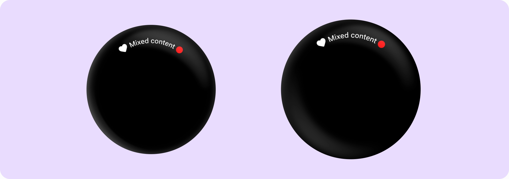
Example of applying Modifier.drawCurvedToEdge to mixed content:
import androidx.compose.foundation.background
import androidx.compose.foundation.layout.Box
import androidx.compose.foundation.layout.Row
import androidx.compose.foundation.layout.padding
import androidx.compose.foundation.layout.size
import androidx.compose.foundation.shape.CircleShape
import androidx.compose.ui.Alignment
import androidx.compose.ui.Modifier
import androidx.compose.ui.graphics.Color
import androidx.compose.ui.res.painterResource
import androidx.compose.ui.unit.dp
import androidx.wear.compose.material3.DrawCurvedToEdgeDefaults
import androidx.wear.compose.material3.Icon
import androidx.wear.compose.material3.Text
import androidx.wear.compose.material3.drawCurvedToEdge

// Anything that draws can be curved, not just text.
Row(
    Modifier.drawCurvedToEdge(DrawCurvedToEdgeDefaults.StaticContentMaxSweepAngle),
    verticalAlignment = Alignment.CenterVertically,
) {
    Icon(
        painter = painterResource(R.drawable.ic_favorite_rounded),
        contentDescription = "Favourite",
        modifier = Modifier.size(24.dp),
    )
    Text("Mixed content", Modifier.padding(horizontal = 4.dp))
    Box(Modifier.size(16.dp).background(Color.Red, CircleShape))
}
| Parameters | |
|---|---|
maxSweepAngle: Float = DrawCurvedToEdgeDefaults.ScrollableContentMaxSweepAngle |
The maximum sweep angle in degrees, |
angularDirection: AngularDirection = AngularDirection.Clockwise |
Specify the direction of the content. Default is clockwise (so that text appears the correct way up while at the top of the container). |
anchor: Float = 270.0f |
The angle at which the content is laid out relative to, in degrees. An angle of 0 corresponds to the right (3 o'clock on a watch), 90 degrees is bottom (6 o'clock), and so on. Default is 270 degrees (top of the container). |
anchorType: AnchorType = AnchorType.Center |
Specify how the content is drawn with respect to the anchor. Default is to center the content on the anchor. |