
Apply these recommended practices to create comfortable, intuitive, and responsive gamepad controls across menus and active gameplay.
Design for player ergonomics
Well-crafted input patterns feel natural and accessible, helping your game reach a wider audience and letting everyone enjoy playing comfortably.
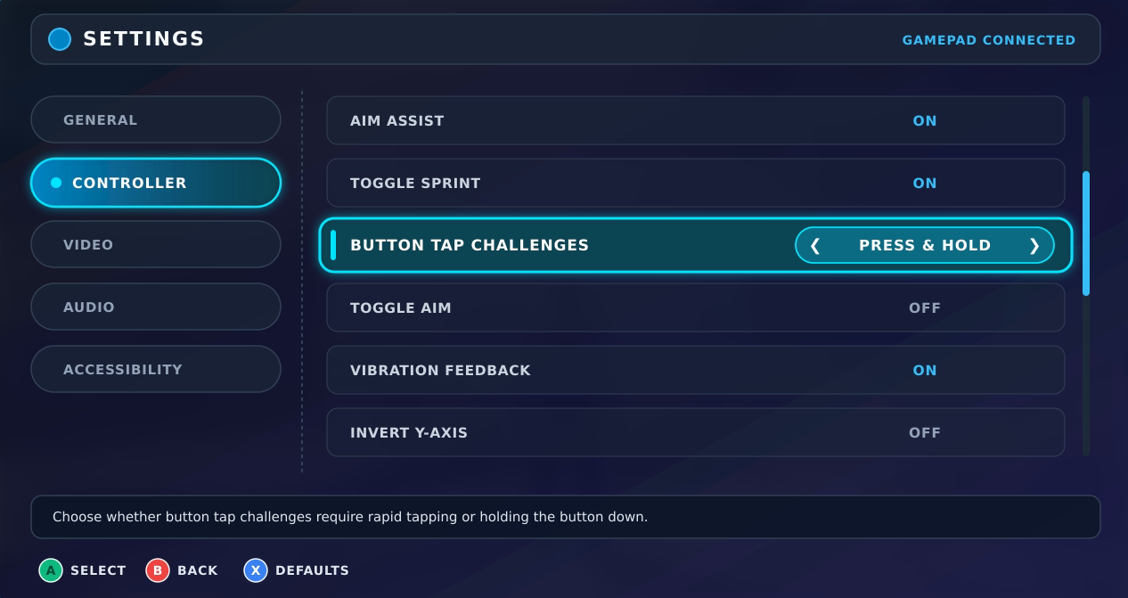
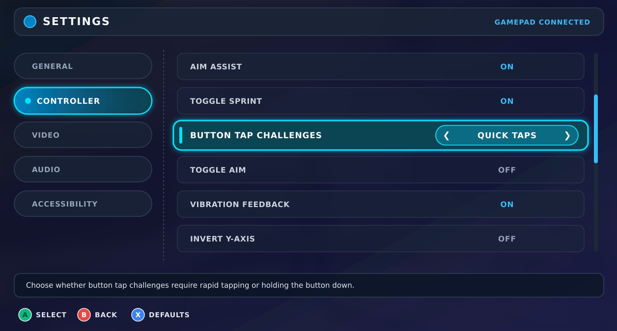
Offer flexible input options for taps and holds
Although fast, repeated presses or continuous holding can be an engaging part of core gameplay, players have diverse physical preferences and accessibility needs. Offer customizable control settings to reduce physical strain. For example, convert rapid-tap or press-and-hold interactions into a single press, provide a toggle mode where one press starts an action and a second stops it, or let players simplify or bypass intensive input sequences altogether.
| Press-and-hold and toggle options | Quick-tap option |
|---|---|
|
|
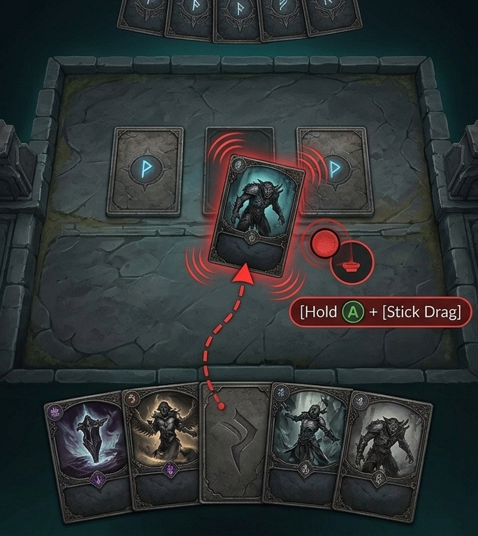
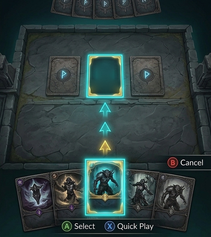
Use two-step selection or shortcuts instead of drag-and-drop
Moving items across the screen is much faster and more precise on a gamepad when you replace hold-and-drag gestures with discrete steps. Let players pick up an item with the confirm button, navigate to the target slot using the directional pad (D-pad) or stick, and press it again to place or swap the selection. For frequent actions with a fixed destination, such as equipping gear, storing loot, or playing a card, you can streamline the flow even further by assigning direct shortcut keys to the focused element.
| Not recommended | Recommended |
|---|---|
|
|
Provide in-game button remapping
Button remapping lets players adjust key actions to fit their controller form factor, grip style, and muscle memory from other platforms. Starting in Android 17 (API level 37), users can remap buttons, sticks, and triggers directly in the system settings. To extend this flexibility to more players across all Android versions, we recommend also providing in-game remapping and keeping on-screen guide icons updated to match the reassigned inputs. For implementation details, see Process controller inputs (Kotlin or Java) and Use custom controller device mappings (C++ Game Controller library).
Map buttons using a hierarchical structure
Organize navigation into tiered levels across both menus and active gameplay so players can access complex interfaces and large skill sets without excessive button presses.
Use tab switching
Assign the shoulder bumpers to top-level menus, and navigate submenus using the D-pad or analog sticks. This two-level approach makes navigation much faster by eliminating the need to step through every single UI element with directional inputs.
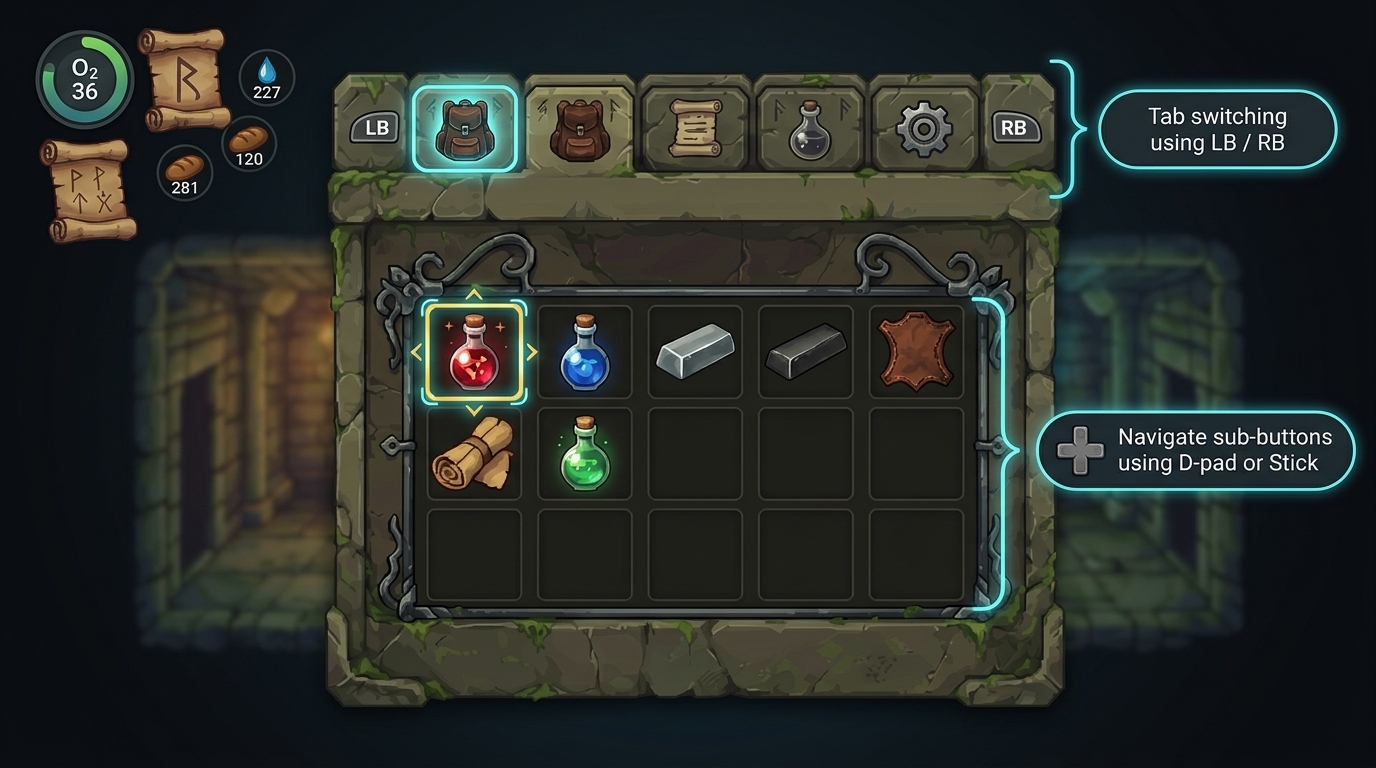
Group UI elements
In complex interfaces or grid-based gameplay such as puzzle boards and strategy maps, group multiple small elements into larger sections. Let players jump between major regions first, and then use the D-pad or analog sticks to make precise selections within the focused group.
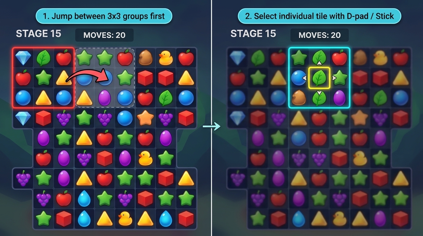
Expand in-game action sets
Organize in-game actions into a two-level hierarchy based on the gameplay context. For real-time actions, map primary moves to the face buttons and use a shoulder bumper to switch them to a secondary skill set. For tactical situations where play pauses or slows down, consider offering a radial menu, such as a skill wheel, where players tilt the stick to choose from more options.
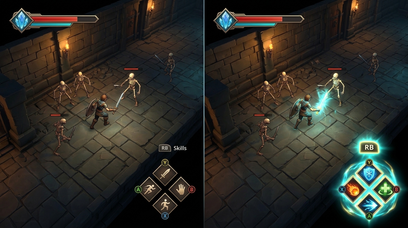
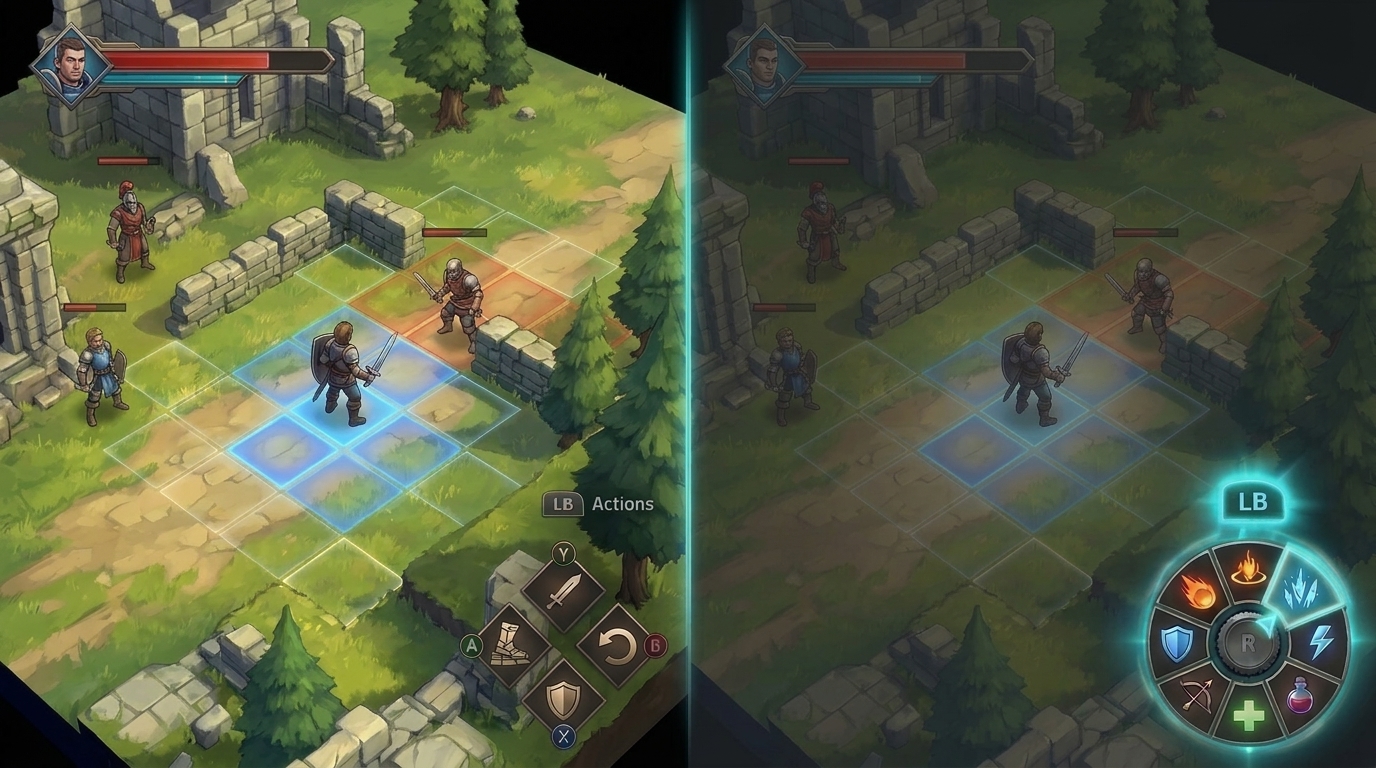
Provide clear visual feedback
Display clear on-screen prompts and focus indicators so players always know which controller inputs are available and which UI element is active.
Display button action guides
Clearly display corresponding gamepad button icons next to interactive UI elements so players instantly know which button to press. In addition, recognize the controller type to display matching iconography and labels for its specific layout. For implementation details, see Common controller types (Kotlin or Java) and Controller device information (C++ Game Controller library).
| Scenario | Guideline | Example |
|---|---|---|
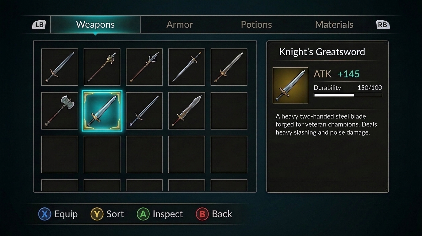
| Complex menu interactions | Provide a dedicated button prompt bar at the bottom of the screen, showing which face buttons equip or sort items and which shoulder bumpers switch tabs, that dynamically updates based on the selected item. |
|
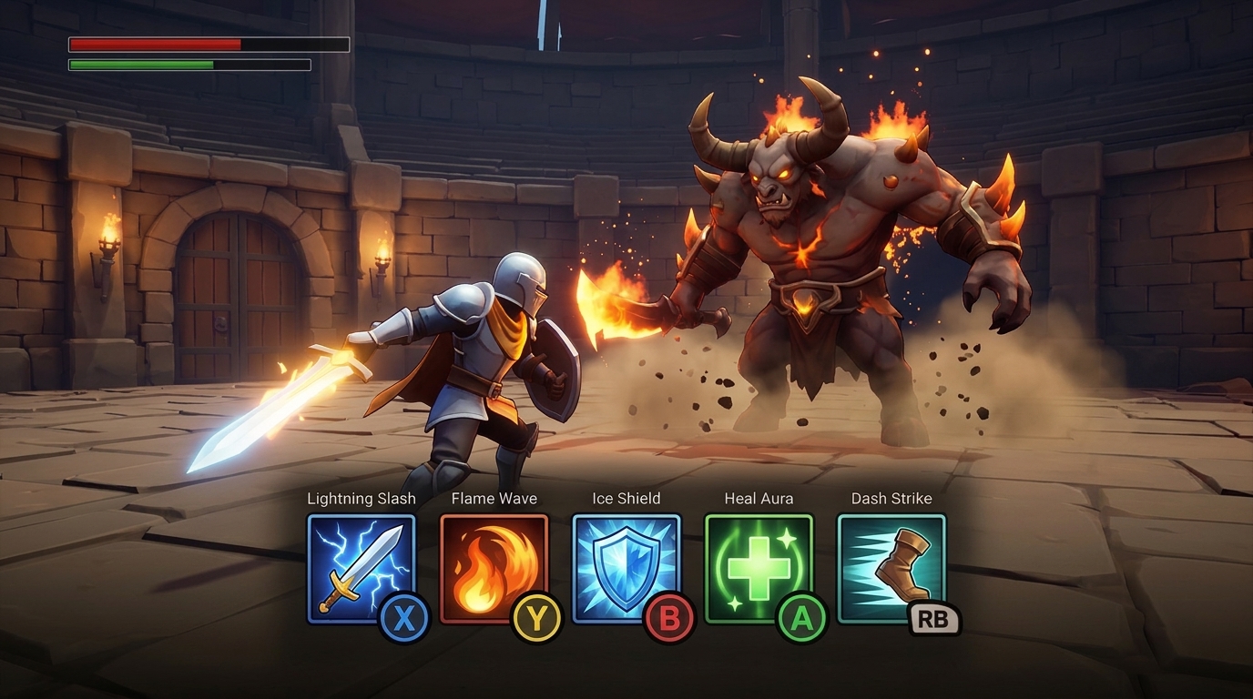
| Combat skill heads-up display (HUD) | Attach small gamepad badges directly onto HUD skill slots or skill bars so players can trigger abilities through instant reflexes. |
|
Highlight active focus states
Use distinct visual cues, such as a highlighted background color, borders, or scaling effects, to clearly indicate which UI element or button currently has controller focus.
| Scenario | Guideline | Example |
|---|---|---|
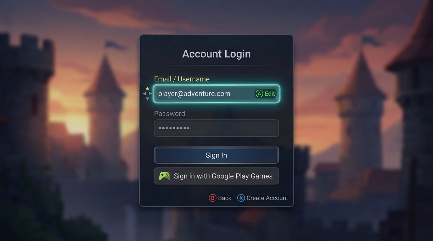
| Account login entry | Clearly highlight the currently selected input field, sign-in option, or action button so players know which field they are editing or submitting before opening the on-screen keyboard. |
|
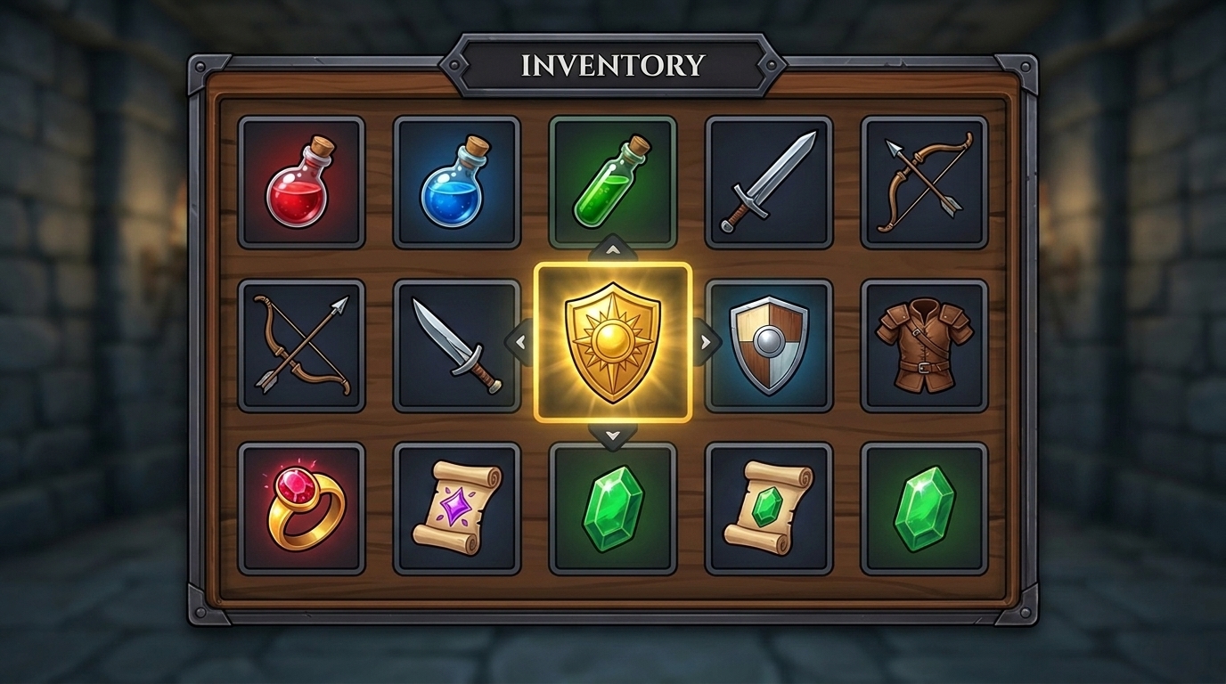
| Inventory and grid menus | Display a bright border or frame around the currently selected slot to clearly indicate the current selection. |
|
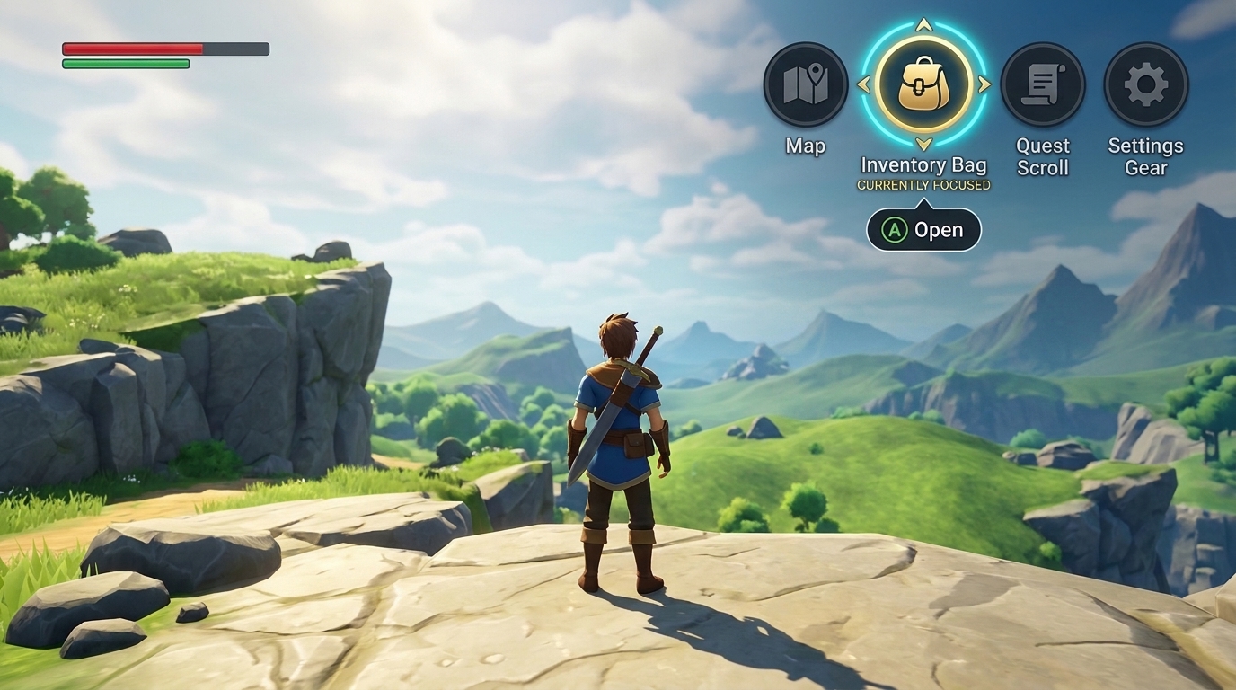
| HUD | When players navigate to on-screen HUD elements, highlight the active HUD element distinctly so it stands out. |
|
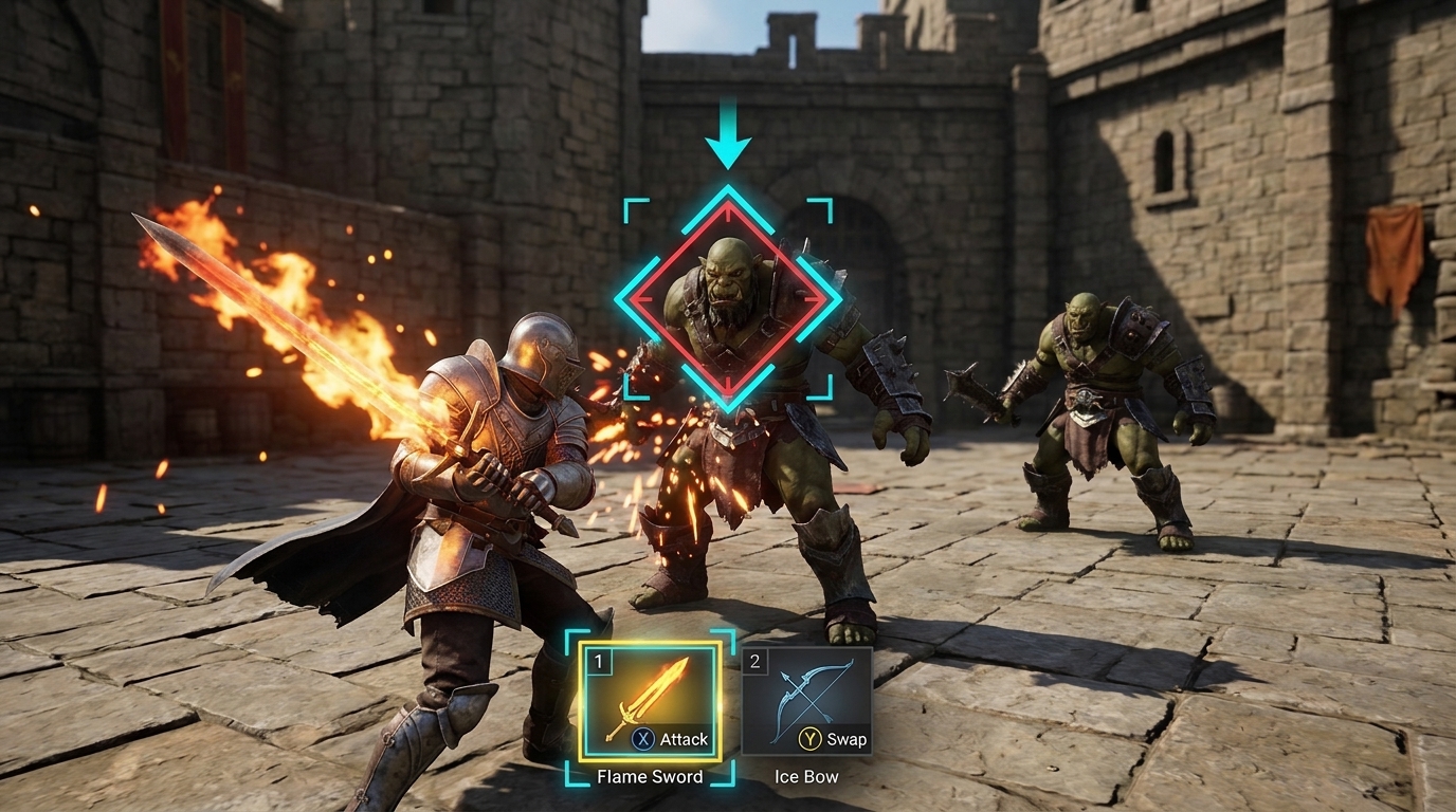
| Active gameplay | During combat or exploration, indicate the currently selected skill, active weapon slot, or locked-on enemy target so players can make quick decisions without losing track of their selection. |
|
Recommended practices for using a virtual mouse
Operating a virtual mouse requires fine cursor control and precision adjustments. In structured menus, settings lists, and grid-based inventories, discrete D-pad or stick navigation is faster and more reliable. However, an optional virtual mouse cursor is useful in non-grid scenarios where directional stepping feels restrictive:
| Scenario | Guideline | Example |
|---|---|---|
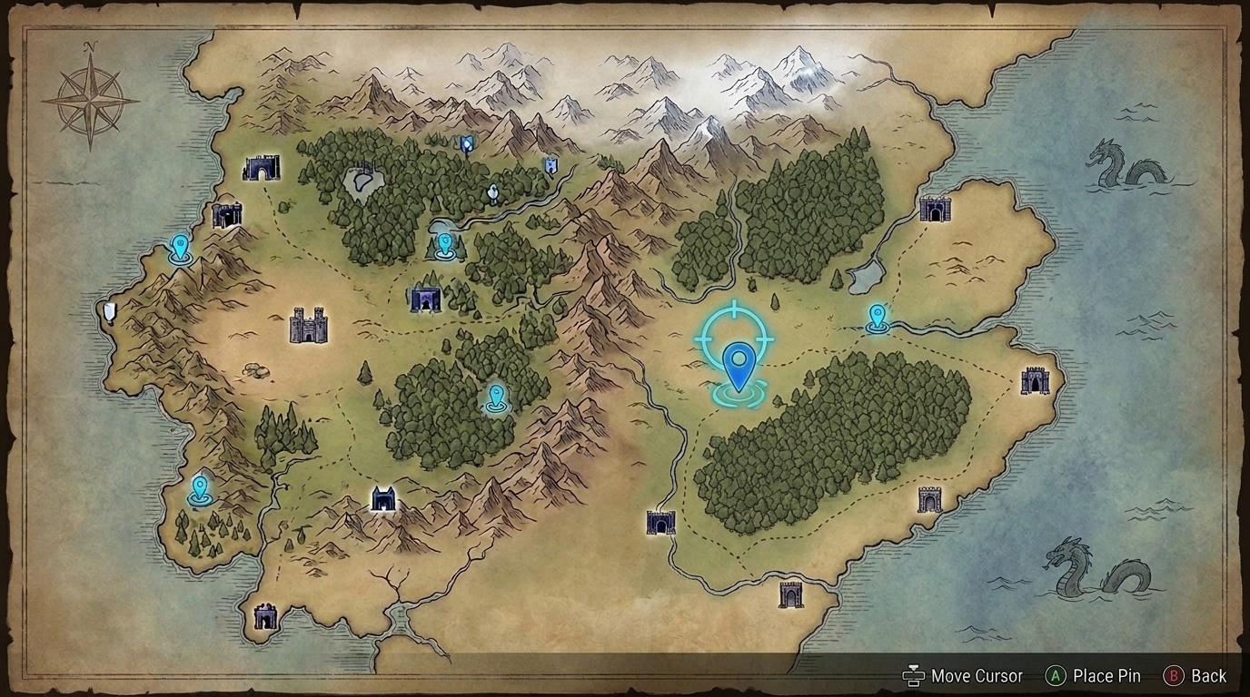
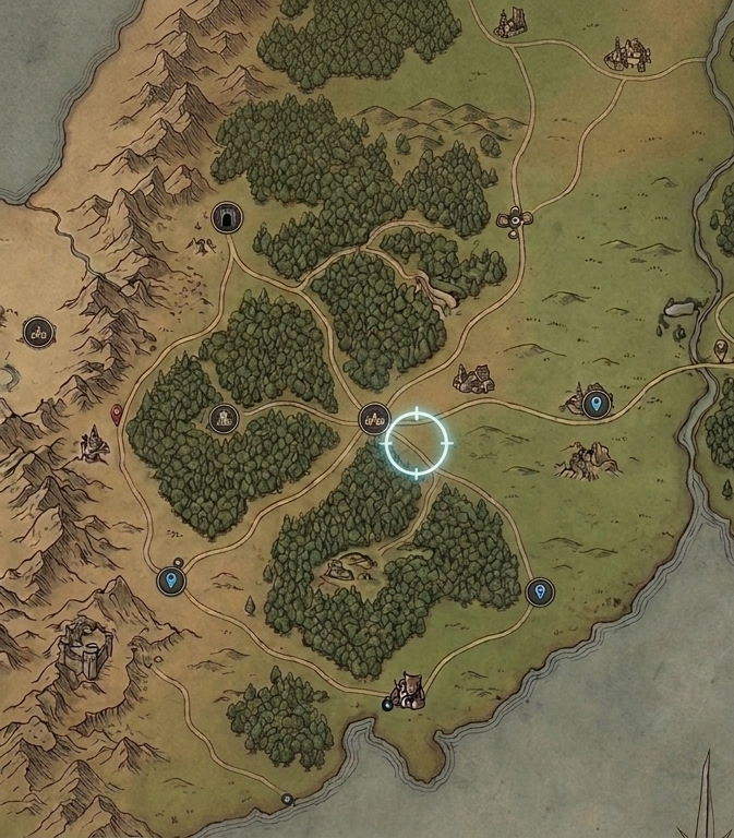
| World maps | Select locations that are scattered irregularly across a map, or place a custom pin on an empty spot where no button exists. |
|
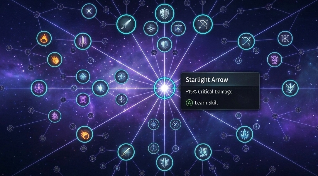
| Non-linear skill trees | Navigate web-like or radial progression trees where nodes branch out at irregular diagonal angles. |
|
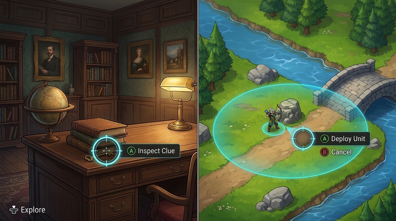
| Inspection and free-form placement | Investigate hidden objects in adventure games without spoiling clues through automatic focus highlights, or freely position units on a non-grid battlefield. |
|
When implementing a virtual mouse, follow these guidelines. If you develop in Unity, see Control a virtual mouse with a game controller in Unity for engine setup details.
Enlarge button touch targets
If buttons or interactive areas are too small, positioning a virtual mouse over them becomes difficult. Scale UI elements adequately for comfortable targeting.
| Not recommended | Recommended |
|---|---|
|
|
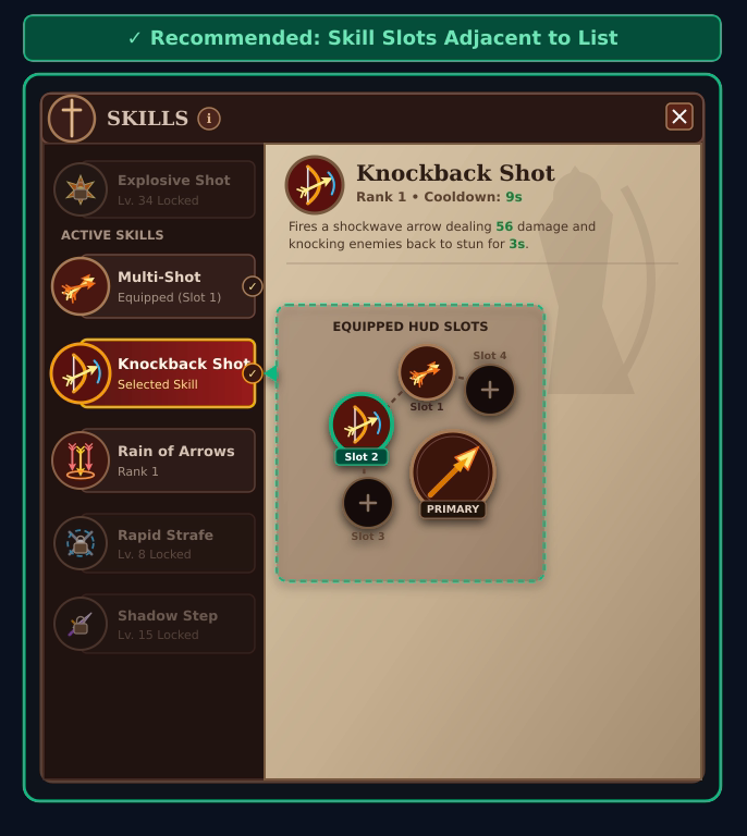
Maintain appropriate spacing between buttons
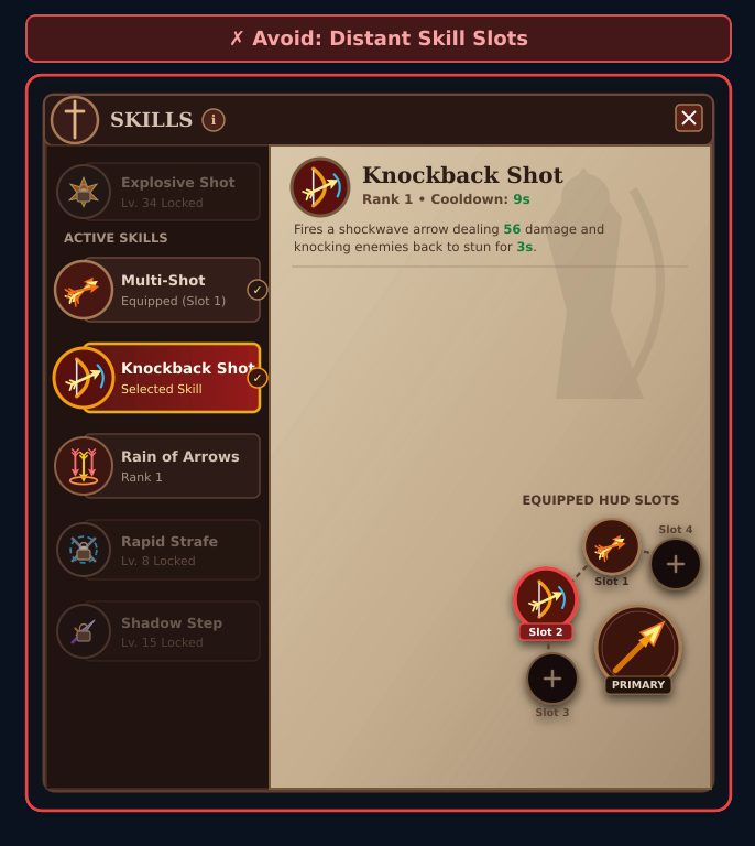
When interactive elements are positioned far apart, moving a virtual mouse across the screen slows down navigation. Group related controls close together by clustering sequential selection and confirmation buttons in the same area, or by opening action menus for equipping, upgrading, or discarding items directly next to the selected slot rather than in a fixed screen corner.
| Not recommended | Recommended |
|---|---|
|
|
Provide smart targeting assistance
To make targeting easier, assist the virtual mouse cursor when it approaches interactive elements based on the screen context:
| Scenario | Guideline | Example |
|---|---|---|
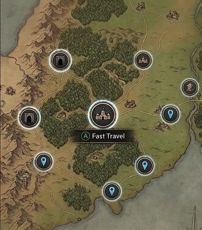
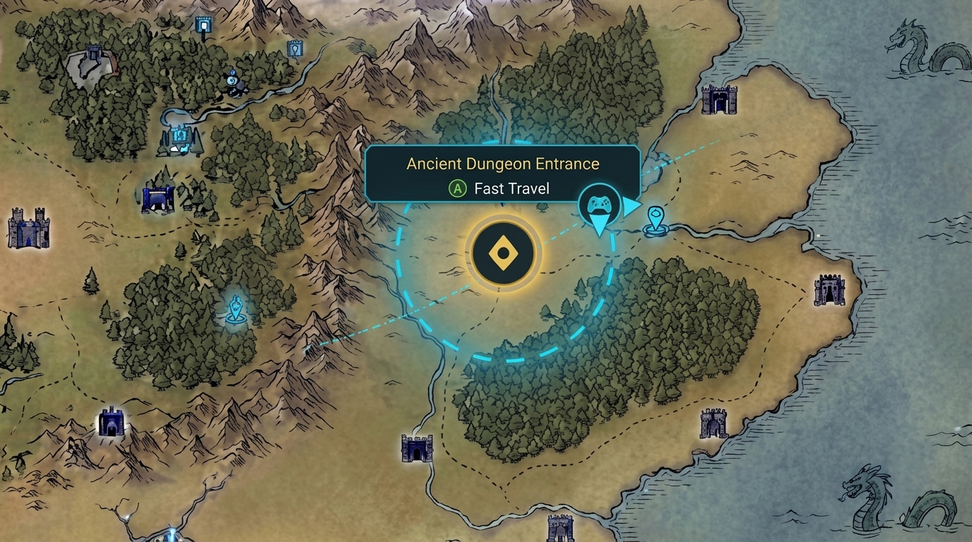
| Wider selection radius | When panning across a map with multiple markers, keep cursor movement free and fluid. Define a wider, invisible selection radius around quest markers, fast-travel points, or dungeon entrances so they automatically highlight and become selectable when the cursor gets close. |
|
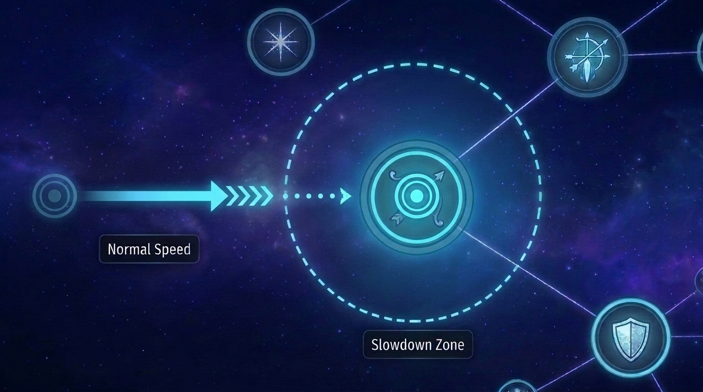
| Cursor slowdown on hover | Slightly slow down cursor speed when passing over interactive skill nodes so players don't overshoot small targets and can stop on the target node comfortably. |
|
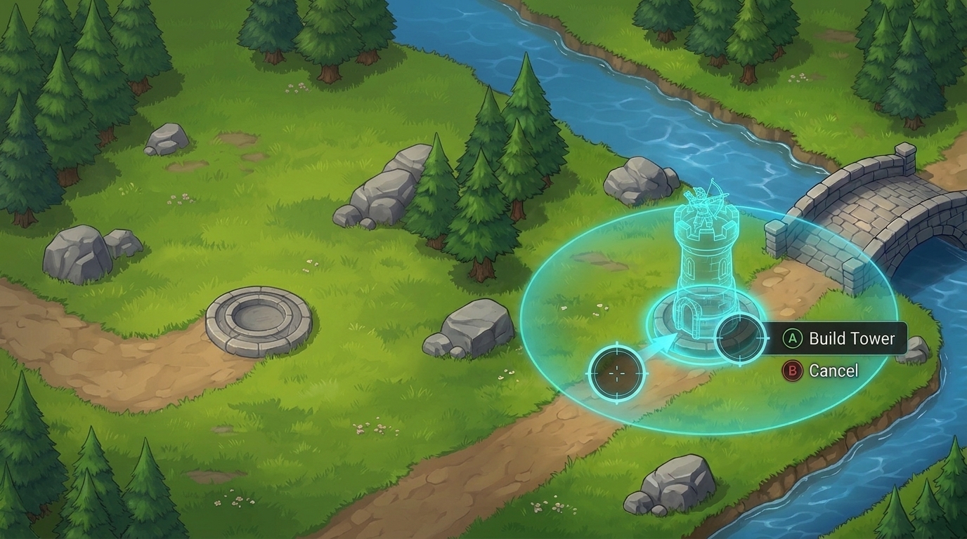
| Placement snapping | When placing structures, units, or items onto valid grid spaces or sockets, such as building towers in a strategy game, snap the placement preview into position when the cursor gets close so players don't have to align it pixel by pixel. |
|